1
Sync for Lemmy Beta 103 release notes
(lemmy.world)
What do we think of the new logo?
Happy with it!
Gorgeous
(シ_ _)シ
Look oddly more mature. I digg it.
A classy evolution of the previous logos. 👍🏽👍🏽
Absolutely gorgeous
Love it! Great new look (ツ)
Looks less reddity, which is good
👏
Loving it dude!
Classy.
Is instance blocking in the app yet and I can't find it?
Instance filtering has been a thing for a while. Or do you mean native blocking?
Like on the website you can block an entire instance.
You're on fire right now!
I know eh? This is how burn out happens though...
They seem to do bursts of progress and then take a break or at least slows down a lot; hopefully that is them balancing things, taking care of themself, and taking care of core responsibilities.
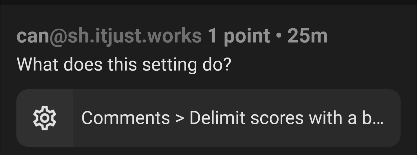
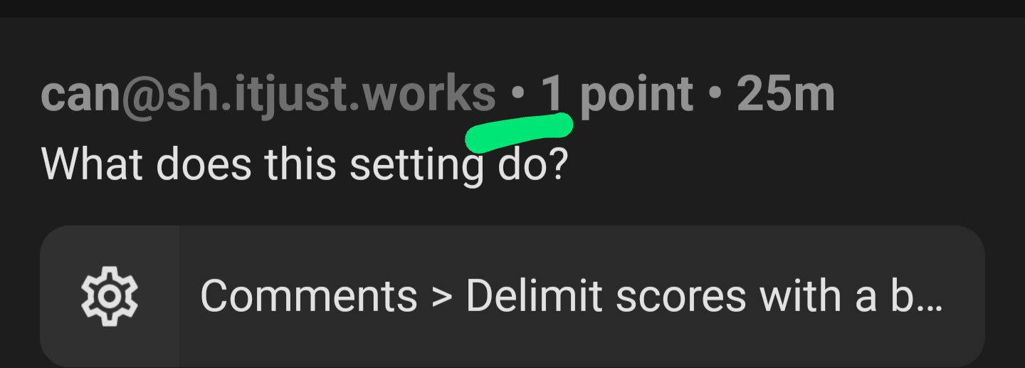
What does this setting do?
Settings shortcut: Comments > Delimit scores with a bullet point
It does what it says on the tin.
You can toggle it and compare the differences.
You can toggle it and compare the differences.
You'd think so but I didn't notice
Toggles this:
Subtle, thanks.
It was great on Reddit when usernames would end with a dash and so it seemed like a comment had a negative score.
Having an annoying bug where regardless of whether I change the upvote or downvote colour, it is the upvote colour that gets changed.
Just fixed and pushed the patch live!
The blue looks nice
Not sure why but it seems like every other version breaks the haptic feedback vibration for up votes on my pixel 6a.
I absolutely appreciate all the work done recently, but I was wondering if there was any chance we could get thumbnails that, when clicked, don't have ?thumbnail=1500&format=webp appended to them. For some posts, it doesn't make a difference, but for longer posts, or posts with smaller text, it makes the image blurry unless you click into the post comments, and select the image there. It feels like a needless extra step when trying to open an image.
yes i have noticed this as well.
sometimes i had to load the image in the a browser and remove the '?thumbnail=1500&format=webp' manually to be able to load the full image
I love the new up/downvote colors but when I swipe on a comment to upvote it's still orange/purple. Anyway to make that match the new upvote color?
This app is great! Keep it up!
Good catch.
Love the new logo, but especially LOVE the option to change upvote and downvote colors!
Given we already have an app icon chooser implemented, could we get an 'old' icon that uses red/blue for up/down? You pretty much just have to rotate the existing icon 180
In Sync Ultra previews, when no image is available, the old colors are still shown:
Oooh good spot cheers
Do you think you'd be able to add a means of embedding images in a comment, please? We're pretty close with the link feature, but it just needs an exclamation mark for it to embed.
Thank you!
What do you mean sorry? Sync already adds the !
The post editing update is amazing.
When previewing the post or comment being made, pictures that are in the portrait style aspect ratio do not show up in the preview.
Here's an example:
Landscape
Portrait
Landscape
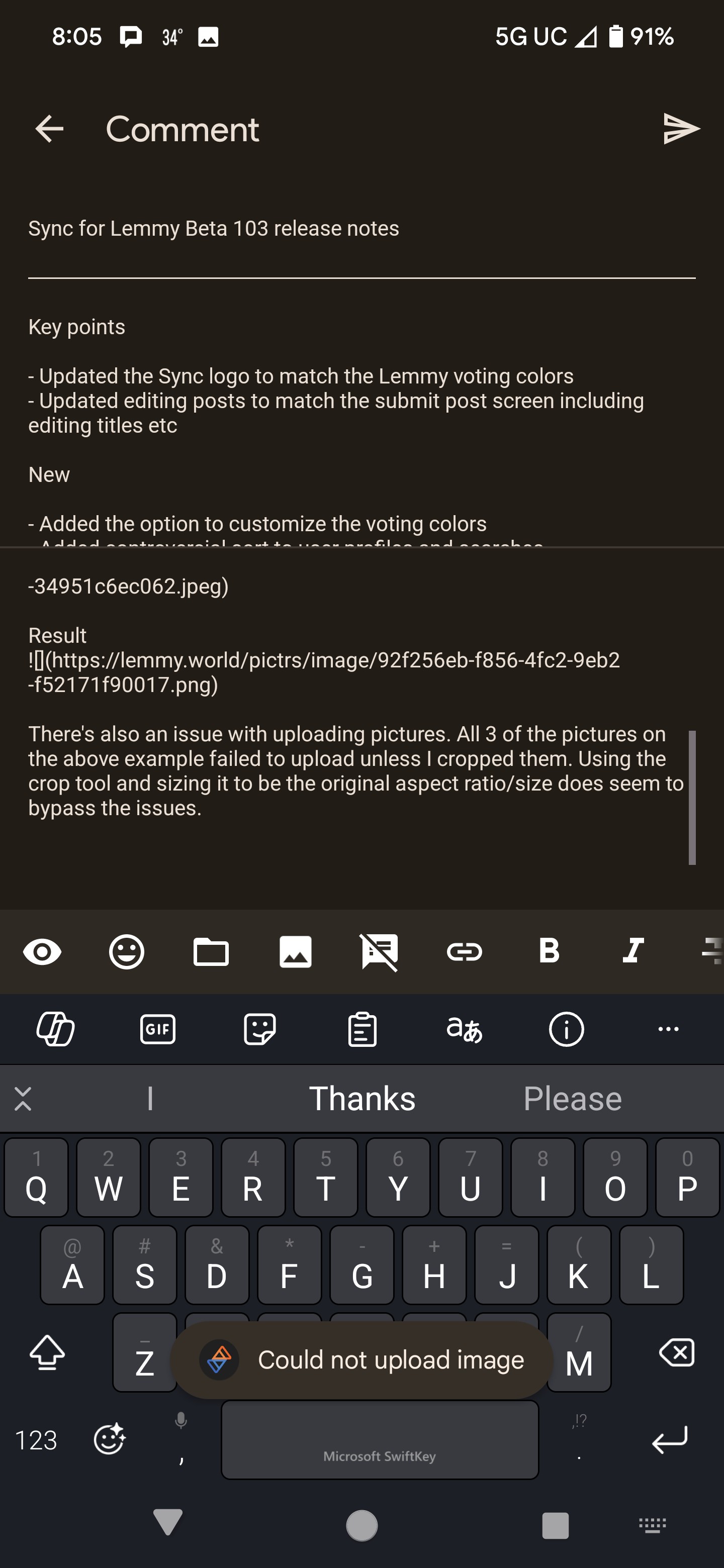
Result

There's also an issue with uploading pictures. All 3 of the pictures on the above example failed to upload unless I cropped them. Using the crop tool and sizing it to be the original aspect ratio/size does seem to bypass the issues.
Cropped example

All of your pictures loaded and looked fine for me.
And uploading also works fine for me. It's probably an issue with your instance or file format? Are your pictures JPEG, or maybe some other format such as HEIC? (By cropping, it's probably converted to jpeg regardless of what the original format was)
Just confirming that all 3 pictures also display correctly for me:

If I understood it correctly, it's when previewing the comment/post, not when viewing an already made comment/post.
LJ is coming back and is absolutely crushing it with these updates. Thank you, sir. (シ_ _)シ
Swipe left on comment/post to upvote still the old orange colour. Otherwise, looking great!
Not sure if it's just me, but now upvotes are blue and down votes orange in both the button color and the vote count color after voting. Seems backwards? I'm used to orange being upvotes and blue being down.
Oh, you must have missed the whole conversation here: https://lemmy.world/post/12922184
There was a whole thing about it. This is how Lemmy itself does it, so Sync changed to match.
Edit to add: 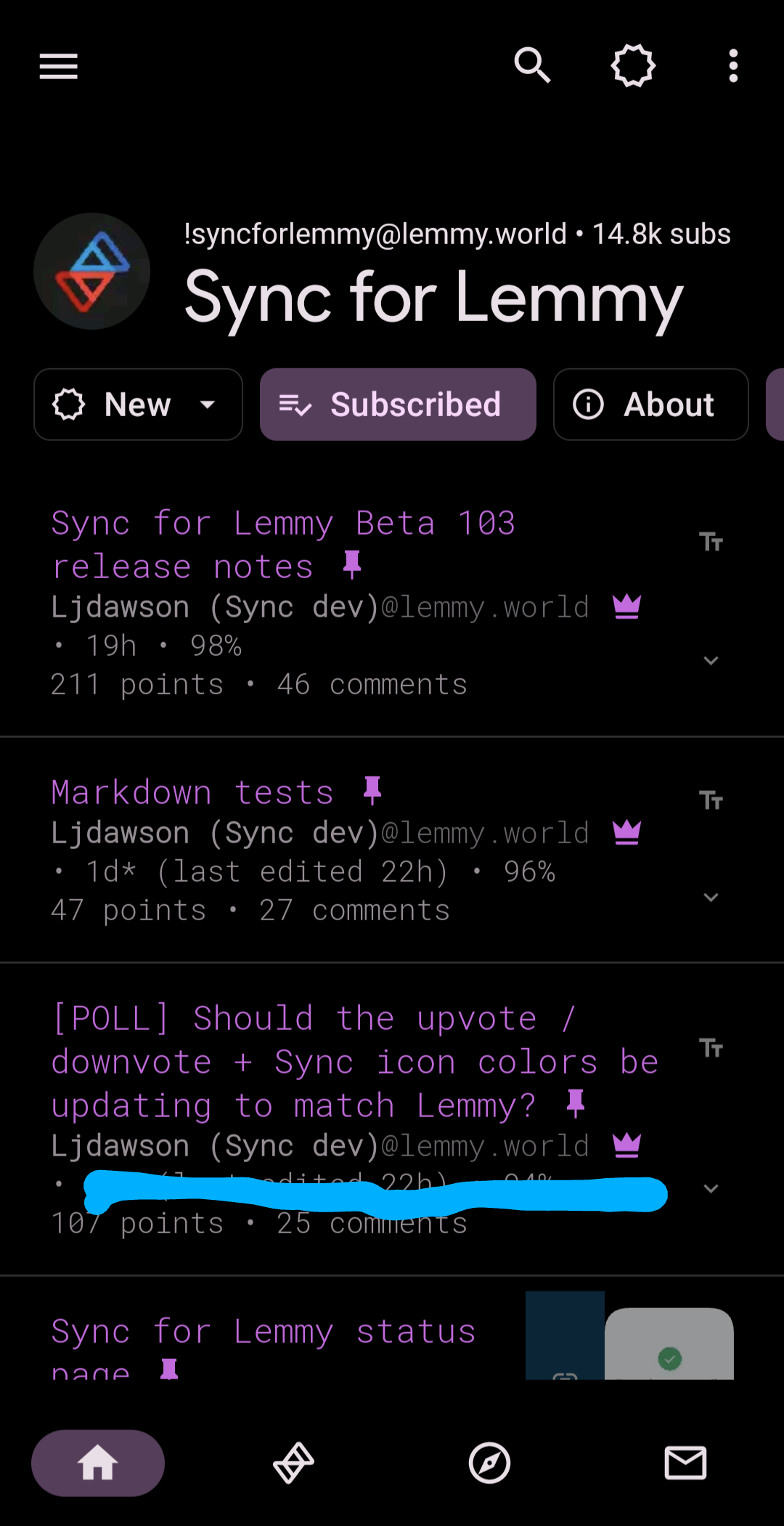
Oh that's weird (that Lemmy is reversed I mean). I guess I can just customize them back so no big deal. I kept getting confused thinking I accidentally downvoted stuff.
That's fair, and why there's the option included to change the colors back 😁
Took me a min to get used to, since I don't really use the web ui much, but I like the colors and it makes more sense to me to follow the colors that actually match the rest of this platform instead of that other one.
I agree that consistency is good, so the change is probably for the better. For me though, the old way makes more sense when considering the nature of the platform: orange for "hot" and blue for "cold". Plays better into the sorting algorithm of the frontpage for me.
👀

Welcome to the official Sync for Lemmy community.
The rules for posting and commenting, besides the rules defined here for lemmy.world, are as follows:
1- No advertising or spam.
All types of advertising and spam are restricted in this community.
Artwork and community banner by: @MargotRobbie@lemmy.world