1
Sync for Lemmy Beta 103 release notes
(lemmy.world)
👀

Welcome to the official Sync for Lemmy community.
The rules for posting and commenting, besides the rules defined here for lemmy.world, are as follows:
1- No advertising or spam.
All types of advertising and spam are restricted in this community.
Artwork and community banner by: @MargotRobbie@lemmy.world
Not sure if it's just me, but now upvotes are blue and down votes orange in both the button color and the vote count color after voting. Seems backwards? I'm used to orange being upvotes and blue being down.
Oh, you must have missed the whole conversation here: https://lemmy.world/post/12922184
There was a whole thing about it. This is how Lemmy itself does it, so Sync changed to match.
Edit to add: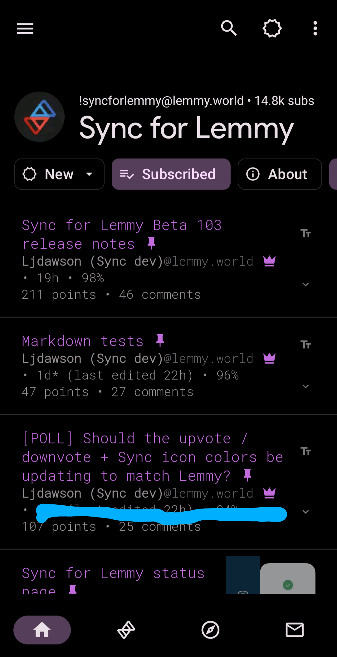
Oh that's weird (that Lemmy is reversed I mean). I guess I can just customize them back so no big deal. I kept getting confused thinking I accidentally downvoted stuff.
That's fair, and why there's the option included to change the colors back 😁
Took me a min to get used to, since I don't really use the web ui much, but I like the colors and it makes more sense to me to follow the colors that actually match the rest of this platform instead of that other one.
I agree that consistency is good, so the change is probably for the better. For me though, the old way makes more sense when considering the nature of the platform: orange for "hot" and blue for "cold". Plays better into the sorting algorithm of the frontpage for me.