this post was submitted on 21 Jul 2023
47 points (88.5% liked)

Technology

55940 readers
4285 users here now

This is a most excellent place for technology news and articles.


Our Rules


  1. Follow the lemmy.world rules.
  2. Only tech related content.
  3. Be excellent to each another!
  4. Mod approved content bots can post up to 10 articles per day.
  5. Threads asking for personal tech support may be deleted.
  6. Politics threads may be removed.
  7. No memes allowed as posts, OK to post as comments.
  8. Only approved bots from the list below, to ask if your bot can be added please contact us.
  9. Check for duplicates before posting, duplicates may be removed

Approved Bots


founded 1 year ago
MODERATORS
 

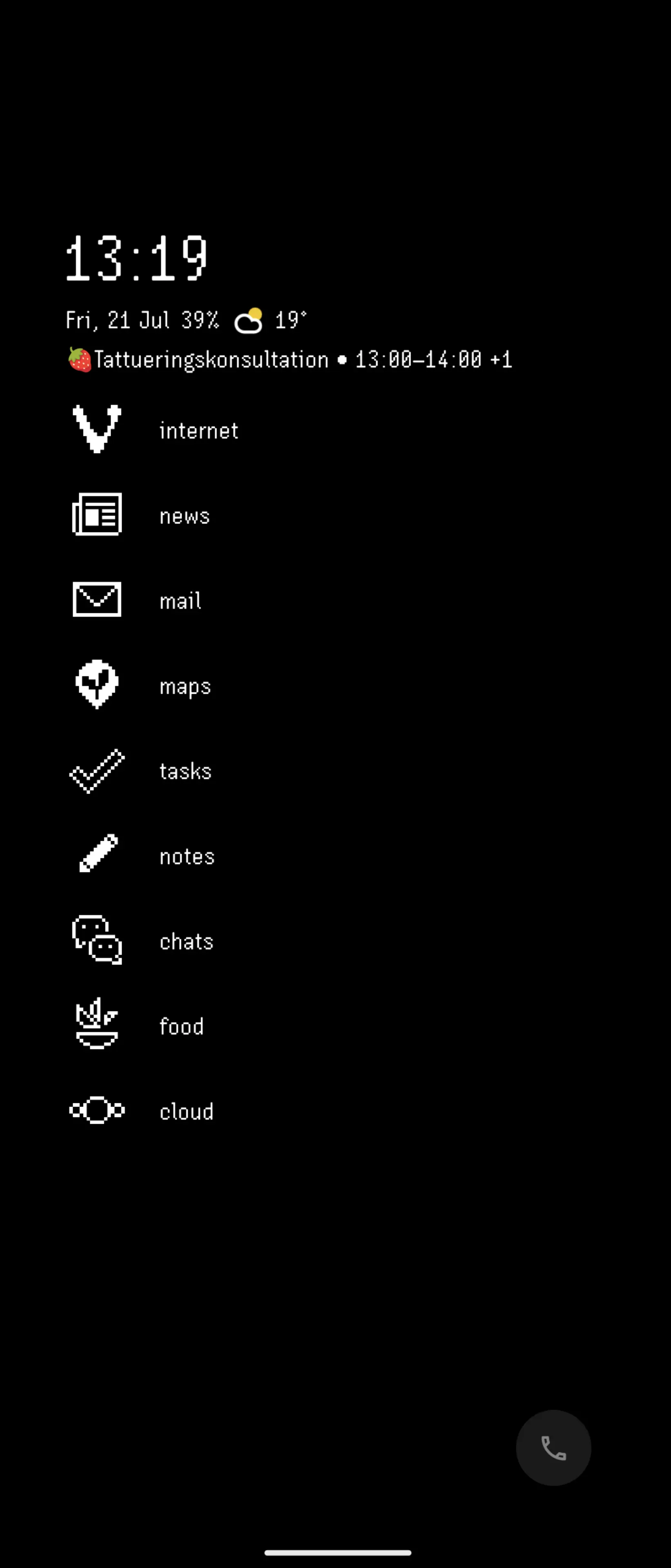
Despite its failure to capture a significant market share, I really enjoyed the metro UI on windows phone and tablet. One UI on my Samsung was getting stale and has a nearly unusable apps drawer, and standard Android notifications are nagging and ungainly.

So I went looking for launchers and icons to get my live tiles back, and what do you know, these are available and they rule. Sharing here so others can try, plus a killer home screen background for good measure.

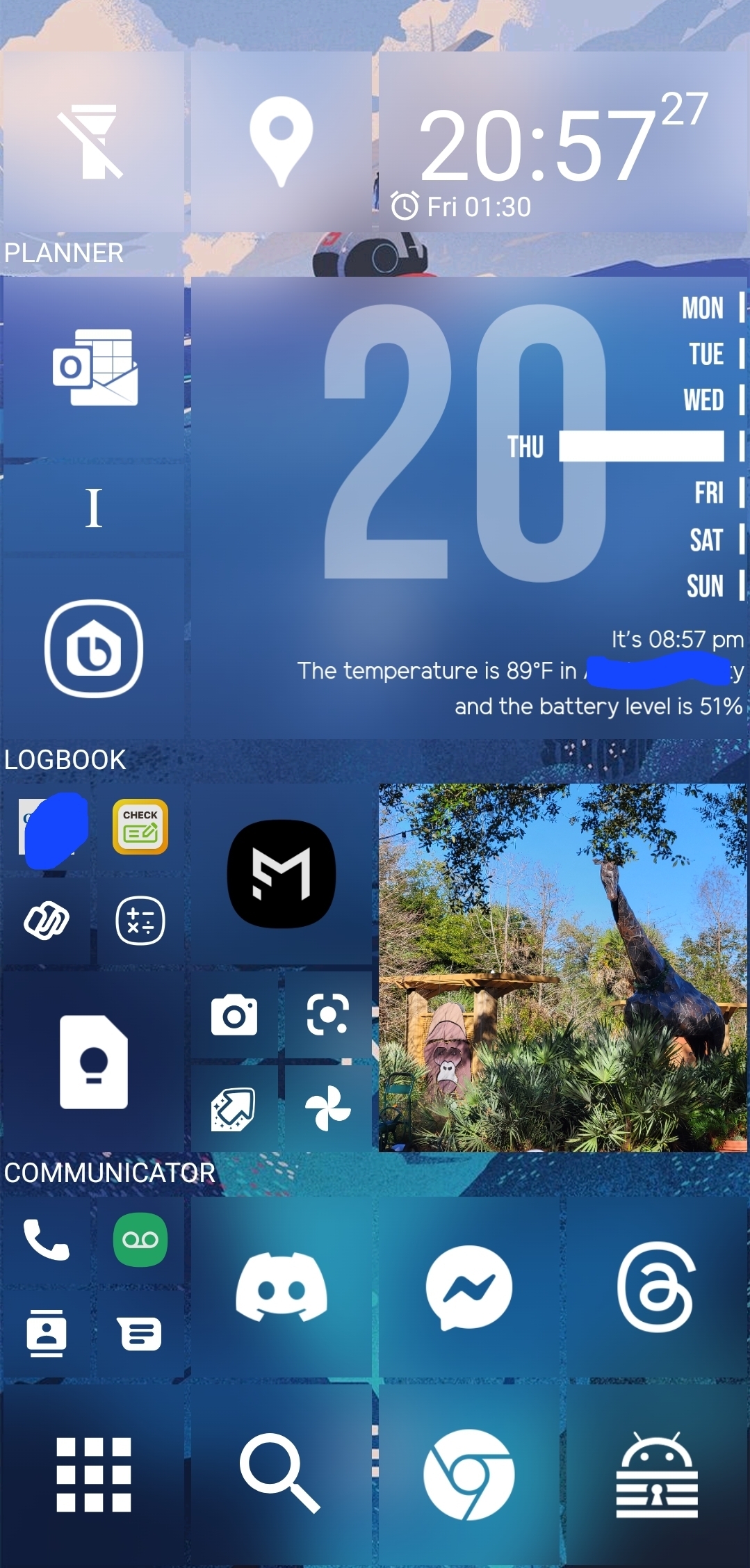
Apps: SquareHome and WHicons

Squarehome is surprisingly thorough in replicating live tile functions - all apps which are capable of image notifications will display on the home screen with a pic and summary/text right on the icon. You can dismiss with a long press, and exclude any apps from notifications that you prefer.

The consequence of this is that you don't need to use the android notification list at all if you don't want, and by getting selective you can avoid the bombarding nature of android style alerts. I actually find myself checking the apps LESS, and I consider it a good thing.

The launcher also gives you some interesting options for hiding the ever-present android interface: you can hide the top bar while on the home screen(s), as well as the nav buttons. You can enable scrolling instead of paging for your home. There are built-in shortcuts to storage, settings pages and configurables (silent mode, wifi etc).

Tile sizes are fully customizable. Included widgets are compatible with the major productivity suites. (Switched to outlook as you might imagine). Most users suggest using WHicons for the right look, which has a few thousand icons that automatically apply to the appropriate app.

App drawer has a list function if you hate the Samsung UI app moshpit. And I do. It also has a full suite of software and hardware shortcuts for things like 'activate flashlight' or 'load a file using this application'.

Spent a few days fiddling, but I couldn't be happier with it now.

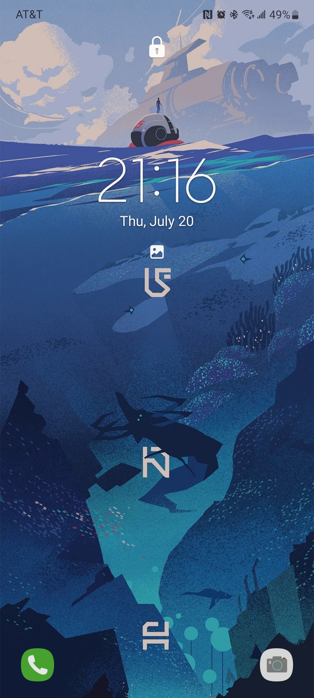
The background is by u/jmlan

top 30 comments
sorted by: hot top controversial new old
[–] TenderfootGungi@lemmy.world 8 points 1 year ago (1 children)

I still believe Microsoft rolled over too easy on their phone OS. They should have dug in until they were competitive like they did with the gaming market.

[–] SquiffSquiff@lemmy.world 4 points 11 months ago

You're forgetting that they had a good market position with Windows Mobile. They saw off Palm and were competing with Symbian and RIM. Then they rebooted with Windows phone and again with Windows phone 7 and again with Windows phone 8 and again with Windows phone 10. Each generation incompatible with the last. Sometimes even known in advance, e.g The 8-10 transition leaving Osborned devices on sale for nearly a year Meantime Android was available 'free' to manufacturers, compatibility was maintained between operating system versions and across manufacturers. Customisation was a big thing for OEMs - look at HTC and Samsung on Android. Every Windows phone had to look IDENTICAL on screen by order of Microsoft.

Microsoft did it to themselves with mobile. Ballmer era MS thought they could 'bulldoze the market' like the early PC era again but that didn't work when they had to actually compete.

[–] TimeNaan@lemmy.world 7 points 11 months ago

The amount of spyware installed on this phone is concerning

[–] BakedGoods@sh.itjust.works 5 points 1 year ago (1 children)

I miss windows phone too! The Nokias were the first smartphones I could recommend to elderly relatives. Might give SquareHome a try for old times sake.

Right now I'm running a very clean Niagara setup. Looks great on the Xperia 1 III amoled.

[–] madcow@lemmy.ml 3 points 1 year ago (1 children)

Looking great! Which font and icons do you use?

[–] BakedGoods@sh.itjust.works 3 points 1 year ago* (last edited 1 year ago)

Retro Mode - Light Icon pack, and Jogan Soft Rgw Ky font

[–] nexas_XIII@lemm.ee 5 points 1 year ago (2 children)

It's been a hot minute since I've used Android but that looks very.... Busy. I'm glad it's working for you though, even with Android I didn't go crazy with widgets unless I was rooted with adjustments. I do love quick action shortcuts though, glad when iOS added their version of "if this then that". Definitely missed that the most

[–] Captain_Shakespeare@reddthat.com 0 points 1 year ago (1 children)

It's definitely not for everyone! I like being able to group functions by size and position, vs just a bunch of app bubbles, and the cubist look is oddly satisfying.

It's useful for me to get the whole picture, or whip open a productivity app, in one tap or swipe, so I can get back to whatever else is happening. So, on a 6.2in, everything is very readable.

[–] nexas_XIII@lemm.ee 1 points 1 year ago

And that's why customizationss and options are so important. What works for one doesn't for all. Thanks for sharing in case others would like to try/use it!

[–] MedicPigBabySaver@lemm.ee 0 points 1 year ago

This crap is super messy! Fuck that.

[–] JigglySackles@lemmy.world 5 points 1 year ago

I instinctively swiped left to pull up the app list. I miss my Windows Phones. I died hard on the platform. I was the first in my state to own a WP7. And I clung to win phone 10 until my last one broke and there were no new models to get. I really wanted the platform to succeed. But MS I think had burnt way too much mindshare and it has been so hard for it to cling that back.

[–] Jay@sh.itjust.works 3 points 1 year ago

I really loved Windows Phone. I loved the tiles, the App List, the animations...

After switching to Android, I gave Square Home a try and used it some months. Then I tried Nova and was happy for some years. It had a lot of features that I enjoyed more. Now I use Niagara. And I am as happy with this launcher, as I was with my Windows Phones.

Isn't it great that anybody can use the interface, he or she wants? At least on Android.

[–] Sirence@feddit.de 2 points 1 year ago

I love square home, here's mine:

Older screenshots because I'd have to censor the calendar and the city again and I am lazy.

[–] cloudless@lemmy.ml 2 points 1 year ago

Thank you for this!

10 years on and I still cannot forgive Microsoft for getting out of mobile market. I was at my most productive and efficient on Samsung Ativ S, then various Lumias until they pulled the plug.

[–] Imgonnatrythis@lemmy.world 2 points 1 year ago

I've used square home for quite awhile now, but I only use it as a launcher in my car. The big simple icons and customizability make it the perfect driving app. I tried many, but I could never find a turn-key driving app that I liked.

As for out of car use, I really haven't had an issue with one UI and have stuck with that. Your example is far too busy for me, but glad you discovered square home and like it.

[–] chriscrutch@lemmy.world 2 points 1 year ago

As a full-time linux user since 2005 and a guy who swears every time he has to use a windows machine now, the Windows phone was actually really good. It had very few apps available and it certainly never took off commercially, but my girlfriend had one back in the day and it was a surprisingly nice piece of work.

I have no doubts that if it had gained traction and still been around today that it would be absolutely unusable.

I gave this a crack and I am loving it so far. Thanks for the post.

[–] benwubbleyou@lemmy.world 1 points 1 year ago* (last edited 1 year ago)

A couple notes on your design. I think it’s a really great step in what could be a really slick skin, my only major gripe is the inconsistency in what you are doing.

I hope this doesn’t come off as being negative or nit-picky, but a lot of the elements in your design are clean, but they aren’t completely cohesive.

First thing is padding and spacing. One thing that is really throwing me off is the inconsistent spacing for your text and iconography. Your text labels for each major section are great, but they should be given the same spacing as the icons on the screen. It’s causing my eye to dart around rather than follow the flow of your screen. This also is the case with your week calendar widget, if you moved those bars and days over a bit to the left to be in line with the rest of your design it would be a lot more cohesive.

Almost all of the “problems” that I see with the design could be fixed by building out a grid system and aligning all your objects to it. If you check out the metro design system windows still uses, icons and type all have specific rules for where they go and how they behave. Try to follow those rules and it will definitely improve.

Second and much smaller is a lack of hierarchy. I am not sure what I should be looking at first when I see this. However, because this is a phone screen, it might be very readable for you. I think taking advantage of accent colours would draw your eye to your most used apps and make them easier to tap onto. I think adding a splash of colour or toning to each square would give it a bit more clear sense of what everything goes. iMessage bubbles do this, the colour becomes less saturated the further away the message is from the keyboard, this is a really subtle way of drawing your eye to where the keyboard is.

I think this design is a really good start, but I think with some tweaking, this will be excellent. I would love to see a version 1.1!

[–] little_hoarse@sh.itjust.works 1 points 1 year ago

Thanks I hate it

[–] Saturdaycat@kbin.social 1 points 1 year ago

Ahh windows phone. I had a Nokia with windows phone. I really wanted that tiny one took, the one that failed immediately. That's why I had a few Palm phones that ended up being my favorites given that I adored my old Palm pilot

[–] airbussy@lemmy.one 1 points 1 year ago

Fellow Ex-Windows Phone user who misses the UI. I've always used Launcher 10 to emulate the Windows Phone experience. Works quite good but sadly it's a bit buggy on my OnePlus 6. Tends to crash and it will not always show all the apps in the app list.
But this looks good! I'll definitely give this a try.

[–] DharkStare@lemmy.world 0 points 1 year ago

I really like the Subnautica background and really dislike that icon layout. It's way too busy for me.

[–] sabriy01@lemmy.world 0 points 1 year ago (1 children)

Can you share your wallpaper? I liked it

Sure! It's by u/jmlan on reddit, they also have an Etsy.

[–] MedicPigBabySaver@lemm.ee -2 points 1 year ago (1 children)

Holy Fuck! That home screen is ridiculous.

I have NOTHING on my home screen.

I have quick access to fav apps on a sidebar and all other quick settings from the top pull down.

This is a mess! Ewwww .. NO!

[–] sputtersalt@lemmy.world 3 points 1 year ago (2 children)

I feel like there are kinder ways to express your opinion than to say "ew" about something someone made for themselves...

[–] Captain_Shakespeare@reddthat.com 0 points 1 year ago* (last edited 1 year ago) (1 children)

That's ok lol, it's just a phone! My goal is to treat it as a tool, vs just scenery and this is more configurable than the standard Android grid. I don't think anyone is being mean, but the extreme range of opinions is pretty funny!

[–] sputtersalt@lemmy.world 0 points 1 year ago (1 children)

It's busy but it looks similar to how I've been wanting to set up my home screen for ages. I have the standard grid right now but I took a look at some widgets and I'm having a vision of a brighter future lol. Redoing my home screen will be my self-care activity this weekend haha

If it helps, I'm left-handed, so it's grouped in a sort of arc from the bottom left corner - apps for quick one-handed use are inside the arc, and the rest is either informational or the start point for a more involved activity like web browsing. It looks 'cluttered' because I didn't really lay it out as a generic or intuitive interface, but specifically to match my needs and habits. I think a home screen should be utilitarian - 'pretty' is for lock screens. Hope I didn't send you down too deep a rabbit hole - Although sometimes that can be fun, so good luck!

[–] MedicPigBabySaver@lemm.ee -5 points 1 year ago

Yuck! That better?

load more comments
view more: next ›