Despite its failure to capture a significant market share, I really enjoyed the metro UI on windows phone and tablet. One UI on my Samsung was getting stale and has a nearly unusable apps drawer, and standard Android notifications are nagging and ungainly.
So I went looking for launchers and icons to get my live tiles back, and what do you know, these are available and they rule. Sharing here so others can try, plus a killer home screen background for good measure.
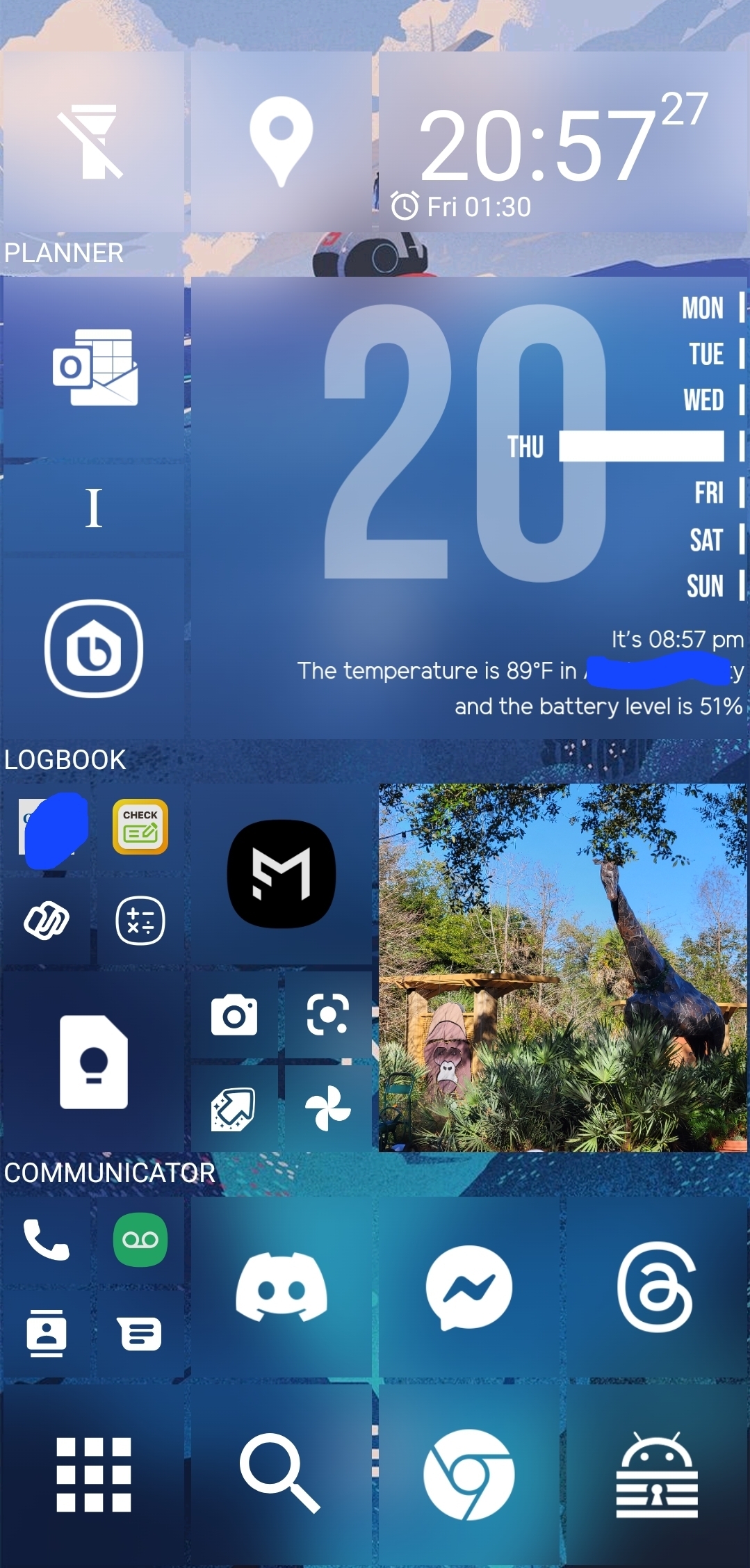
Apps: SquareHome and WHicons
Squarehome is surprisingly thorough in replicating live tile functions - all apps which are capable of image notifications will display on the home screen with a pic and summary/text right on the icon. You can dismiss with a long press, and exclude any apps from notifications that you prefer.
The consequence of this is that you don't need to use the android notification list at all if you don't want, and by getting selective you can avoid the bombarding nature of android style alerts. I actually find myself checking the apps LESS, and I consider it a good thing.
The launcher also gives you some interesting options for hiding the ever-present android interface: you can hide the top bar while on the home screen(s), as well as the nav buttons. You can enable scrolling instead of paging for your home. There are built-in shortcuts to storage, settings pages and configurables (silent mode, wifi etc).
Tile sizes are fully customizable. Included widgets are compatible with the major productivity suites. (Switched to outlook as you might imagine). Most users suggest using WHicons for the right look, which has a few thousand icons that automatically apply to the appropriate app.
App drawer has a list function if you hate the Samsung UI app moshpit. And I do. It also has a full suite of software and hardware shortcuts for things like 'activate flashlight' or 'load a file using this application'.
Spent a few days fiddling, but I couldn't be happier with it now.
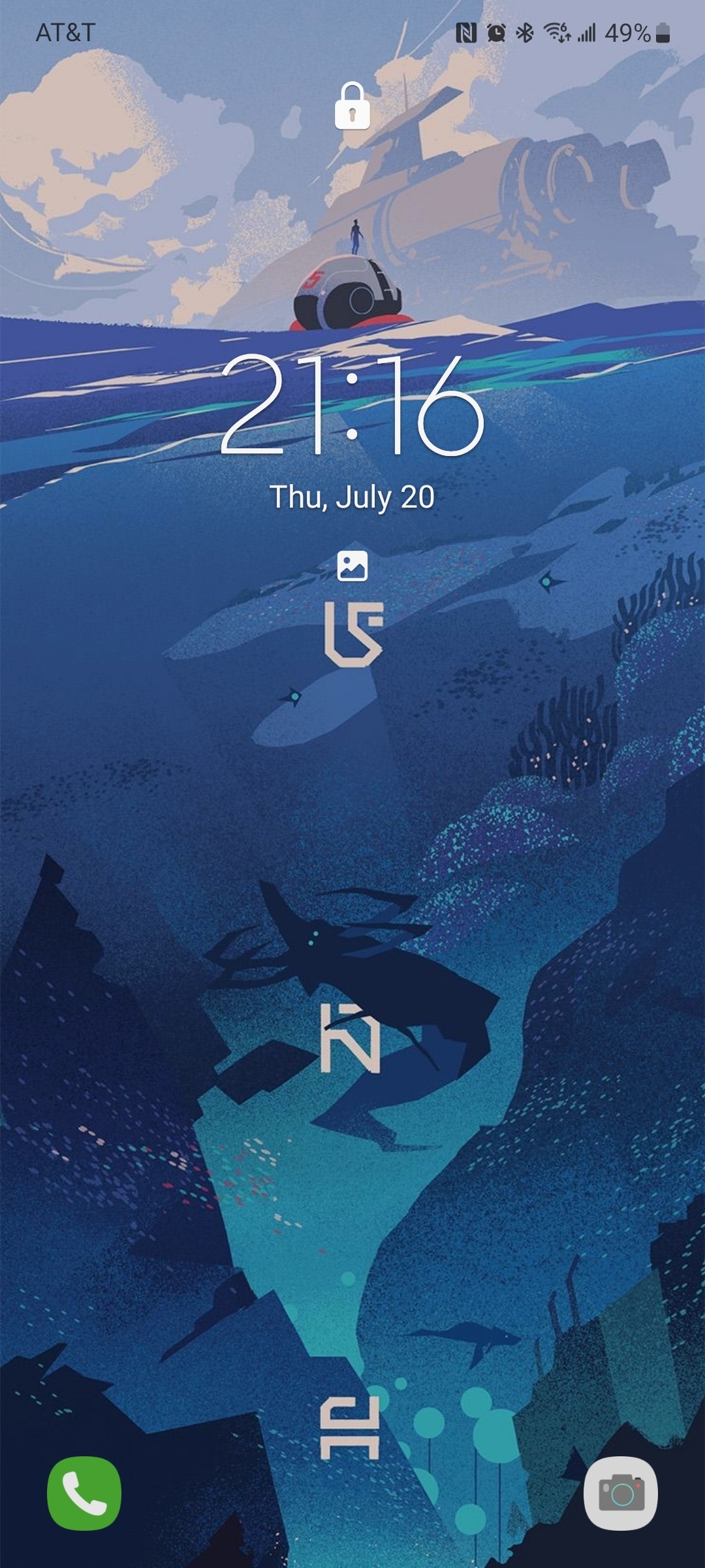
The background is by u/jmlan

A couple notes on your design. I think it’s a really great step in what could be a really slick skin, my only major gripe is the inconsistency in what you are doing.
I hope this doesn’t come off as being negative or nit-picky, but a lot of the elements in your design are clean, but they aren’t completely cohesive.
First thing is padding and spacing. One thing that is really throwing me off is the inconsistent spacing for your text and iconography. Your text labels for each major section are great, but they should be given the same spacing as the icons on the screen. It’s causing my eye to dart around rather than follow the flow of your screen. This also is the case with your week calendar widget, if you moved those bars and days over a bit to the left to be in line with the rest of your design it would be a lot more cohesive.
Almost all of the “problems” that I see with the design could be fixed by building out a grid system and aligning all your objects to it. If you check out the metro design system windows still uses, icons and type all have specific rules for where they go and how they behave. Try to follow those rules and it will definitely improve.
Second and much smaller is a lack of hierarchy. I am not sure what I should be looking at first when I see this. However, because this is a phone screen, it might be very readable for you. I think taking advantage of accent colours would draw your eye to your most used apps and make them easier to tap onto. I think adding a splash of colour or toning to each square would give it a bit more clear sense of what everything goes. iMessage bubbles do this, the colour becomes less saturated the further away the message is from the keyboard, this is a really subtle way of drawing your eye to where the keyboard is.
I think this design is a really good start, but I think with some tweaking, this will be excellent. I would love to see a version 1.1!