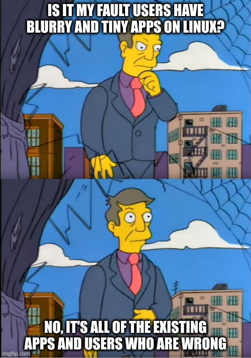
Wuuttup. I'm here complaining again about Framework's Linux unfriendly display. The new one this time.
https://frame.work/products/display-kit?v=FRANJF0001
Old display, 2256 x 1504 (3:2)
GNOME
100% scale
- Nothing looks blurry
- Everything is tiny
- Unusable
100% scale + large text accessibility
- Nothing looks blurry
- Most apps scale appropriately
- Some apps don’t respect GNOME’s large text setting (Alacritty)
125% scale
- Most apps look blurry (Picard, Firefox, Spotify, Alacritty)
200% scale
- Everything is way too big
- Unusable
Plasma
100% scale
- Nothing looks blurry
- Everything is tiny
- Unusable
125% scale + Apply scaling themselves
- Nothing looks blurry
- Most apps scale appropriate
- Some apps can’t scale themselves and look tiny (Picard)
125% scale + Scaled by system
- Most apps look blurry (Picard, Firefox, Spotify, Alacritty)
200% scale
- Everything is way too big
- Unusable
New display, 2880 x 1920 (3:2)
GNOME
100% scale
- Nothing looks blurry
- Everything is tiny
- Unusable
100% scale + large text accessibility
- Nothing looks blurry
- Most apps scale appropriately
- Some apps don’t respect GNOME’s large text setting (Alacritty)
- Everything is tiny
150% scale
- Most apps look blurry (Picard, Firefox, Spotify, Alacritty)
200% scale
- Everything is way too big
- Unusable
Plasma
100% scale
- Nothing looks blurry
- Everything is tiny
- Unusable
150% scale + Apply scaling themselves
- Nothing looks blurry
- Some apps can’t scale themselves, but look a little better here? (Picard)
150% scale + Scaled by system
- Most apps look blurry (Picard, Firefox, Spotify, Alacritty)
200% scale
- Everything is way too big
- Unusable
tl;dr
In the old display, GNOME at 100% + large text was the best compromise. In the new display, Plasma at 150% + Apply scaling themselves is the best compromise.
Interestingly, Picard scaling itself looks super tiny in the old display, but in the new display it looks... better. It's still not correctly scaled like native Wayland apps, but it's better.
Warning
If you can't stomach moving from GNOME to Plasma, then 🚨 DO NOT BUY THE NEW DISPLAY 🚨. The new display is worse for GNOME.
Once again
I am once again begging Framework to just give us a damn regular DPI display that works! Without workarounds. Without forcing users on specific DEs. Without forcing users to stop using their favorite apps. This new display has basically all of the flaws as the previous one.

Thanks for the write up. I was in a similar situation with a 4k 14 inch Dell something, instead of scaling at 200%, I lowered the resolution to half at 1080p and it worked flawlessly. Maybe you could try it too?
The issue here is that some apps don't support scaling, so they show in a lower resolution, making them look blurry.
Your solution just makes everything do that.
Nope, it wasn't blurry. In principle, I lose some DPI goodness, but it didn't make any difference to me on my daily usage of the laptop
Isn't scaling to 200% the same as lowering the resolution to half? And you lose the high DPI for apps that support it too.
I did lower my DPI, yes. But avoiding scaling also made me avoid some Plasma 5 bugs with multiple screens
No, resolution is on layer display server (X11, tools like xrandr), while scaling is, like compositing, on layer window manager (xfwm, kwin, etc).
Is the dispkay 4k on notebook-size? 2k would've been enough, you don't lose pixels if you couldn't have seen them anyway, which is why everything was too small.
It's called angular resolution.
Edit: my bad, visual acuity was the word i looked for.
Btw, https://tftcentral.co.uk/articles/the-obsession-with-4k-and-do-you-need-it-on-a-new-monitor
Yeah I get the display server part. What I meant was that 200% scaling gets you 1920x1080 logical resolution on HiDPI applications -- LoDPI applications continue to be blurry just as if you set your actual resolution to 1080p, but HiDPI applications will enjoy the enhanced visual acuity.
Even on smaller screens like the 14" ones, the quality of very high resolution (e.g. 4K) is still quite visible IMO, especially when it comes to text rendering. But it could very well just be my eyes.
My point is, that you don't see HiDPI if it's too small to be comfortably legible, could be normal dpi instead. On the other hand, a pal of me, that insisted on Windows's scaling, reverted to UHD resolution in the end, because his 4k touchscreen notebook was always hot.
But ok, maybe it depends on other factors if you see a difference, like, on what is your visual focus, etc.
edit: wait, blurry? Then you used a different aspect ratio than your screen?
LoDPI applications are either tiny sized or upscaled (= blurriness), aren't they?