this post was submitted on 07 Apr 2024
217 points (89.2% liked)
Asklemmy
43744 readers
1134 users here now
A loosely moderated place to ask open-ended questions
If your post meets the following criteria, it's welcome here!
- Open-ended question
- Not offensive: at this point, we do not have the bandwidth to moderate overtly political discussions. Assume best intent and be excellent to each other.
- Not regarding using or support for Lemmy: context, see the list of support communities and tools for finding communities below
- Not ad nauseam inducing: please make sure it is a question that would be new to most members
- An actual topic of discussion
Looking for support?
Looking for a community?
- Lemmyverse: community search
- sub.rehab: maps old subreddits to fediverse options, marks official as such
- !lemmy411@lemmy.ca: a community for finding communities
~Icon~ ~by~ ~@Double_A@discuss.tchncs.de~
founded 5 years ago
MODERATORS
you are viewing a single comment's thread
view the rest of the comments
view the rest of the comments

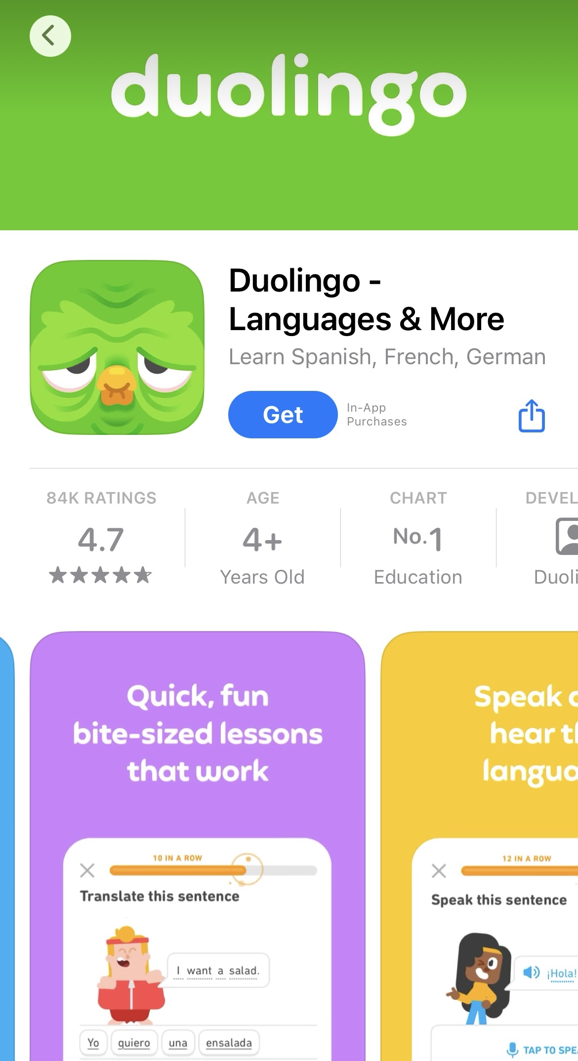
Attention grabbing apparently.
https://stealthoptional.com/apps/duolingo-icon-looks-sad-old/
God I hate marketing bullshit like this.